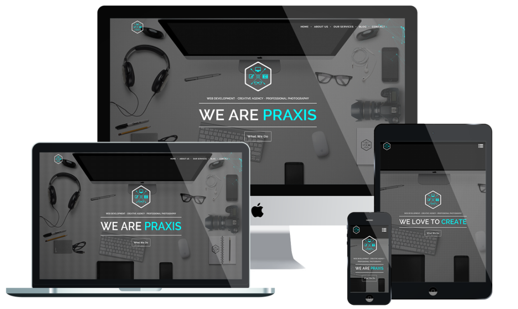
Responsive Design
Is your website responsive for viewing on all media devices and platforms, if not it should be!
Google – Rankings and analytics.
A New Era
Web design is no longer limited to the desktop. With the popularity of portable devices continually increasing, it comes as no surprise that mobile and tablet internet usage is set to overtake desktop internet use by the end of 2015. If you’re site isn’t mobile responsive yet, it should be.
Viewing Experience
One of the first principles to keep in mind when creating a responsive website is making sure that the site is built so that the browsing experience is the same for all. A viewer on their desktop should be getting the same experience as a visitor coming in through their smart phone or tablet.
Make The Change
The team at Praxis are experts when it comes to responsive web design, creating websites that provide the highest user experience no matter the device. We’re here to help move our customers into the mobile age, providing support during every step of the transition.
Strengths Of Our Designs
RETINA DISPLAY READY
A Retina display device, displaying a website that serves Retina ready graphics (higher resolution) will display sharper images and brighter, more vivid colours. A Retina display device such as an iPad3 serving non Retina images (low resolution) will result in poor quality images and a less than optimal user experience. The ultimate aim of Retina display is to improve the user experience and make screen quality almost on a par with print quality.
If you are currently considering purchasing a new website then make sure that retina ready is in bold on your requirements list.
Clean Code
An author is someone who practices writing as a profession. Developers write all day. Yet as developers, it’s easy to forget that each line of code we write is likely to be read 10 or more times by humans during its lifetime. These humans are our fellow co-workers. They’re busy fixing bugs and adding features.
Great authors are known for writing books that tell a clear, compelling story. They use tools like chapters, headings, and paragraphs to clearly organize their thoughts and painlessly guide their reader. Developers work in a very similar system, but simply use different jargon of namespaces, classes, and methods.
User Experience
User Experience (UX) and the ease of site-use is very important to use. Our background is in ecommerce, so we understand how important it is to have a website that runs properly across all platforms. Every website we build is tested rigorously, on multi-platforms, before it’s officially launched.
Mobile web browsing and mobile online purchasing has increased dramatically in recent years and will continue to rise, so we’ll ensure that all newly designed/re-designed websites are fully responsive regardless of your device of choice, from your iPhone down to your old-school Nokia.
Different Platforms
Our team have experience developing sites on:
HTML
Wordpress
Joomla
Drupal
Of course, given that we specialise in digital marketing, we’ll make sure that your website will be fully optimised for search engines. Yours will not be a website that’s left to fall to the wayside!
.
Pricing Options
Basic
Information/Brochure Website- 5 Web Pages
- 5 Email Addresses
- Social Media Integration
- Responsive Website Design, Domain Name & Hosting Setup
Premium
The Best Choice- 10 New Web Pages
- 25 Email Addresses
- Social Media Integration
- Domain Name & Hosting Setup, Google Analytics Setup.
Professional
UNLIMITED FEATURES- 18 New Professional Pages
- Unlimited Email Adresses
- E-commerce Integration
- Domain Name & Hosting Setup, Google Analytics Setup.

